


Muviz Widgets: Clock, Music.,
Sparkine Labs
I usually notice a personalization app most when it solves a small daily annoyance without creating a new one. Muviz Widgets: Clock, Music. takes that approach by putting decorative and useful widgets on the home screen, with a strong focus on clock designs, Material You styling, and music-related presentation. I spent time treating it less like a novelty download and more like something I would keep on my own phone, checking where setup felt smooth, where it needed patience, and which kind of user would actually benefit from it.
Developed by Sparkine Labs, the app belongs to the personalization category and is free to install, with optional in-app purchases priced at $2.49 per item. It is rated for Everyone and requires Android 12 or later, so the intended audience is broad, but the operating-system requirement matters if you are using an older phone. The current version is 1.1.3.0, and its public reception is encouraging: a 4.6 average from around 4.2 thousand ratings, alongside over 100 thousand installs.
Where the experience can get stuck
The first thing I would tell a new user is not to judge the app before placing a widget on the home screen. The app itself may open correctly while the actual result still looks incomplete because Android handles widget placement separately. That distinction is easy to miss. You browse and customize inside the app, but the final object has to be added through the launcher’s widget picker, just like other home-screen widgets.
That extra step is normal, yet it is also the point where many people assume something has failed. If a design appears in the app but not on the home screen, I would first open the launcher’s widget menu and look for the app there. I would then drag the chosen widget onto an empty area rather than repeatedly changing settings inside the app. This simple separation between choosing a style and placing it prevents a lot of unnecessary troubleshooting.
Another possible source of confusion is the visual relationship between a widget and the wallpaper. Material You-inspired designs can look different depending on the colors already present in the system theme. A clock that seems muted on one wallpaper may become much clearer after changing the background or system color palette. I would not immediately assume the widget has poor contrast; I would compare it against the phone’s overall theme first.
Related News

Why WhatsApp Messenger Still Makes Everyday Communication Feel Easy

Jurassic World: The Game Is the Better Dino Tycoon for Strategic Players

Threads in Real Life: Who Should Join, Lurk, or Leave

How SHEIN Turned Shopping Into an Endless Content Feed

How to Make Fortnite Feel Smarter on Mobile

Should You Switch to Microsoft Outlook on Mobile?
The same applies to sizing. A clock can look elegant in a compact space but become cramped if the launcher gives it only a narrow slot. Conversely, stretching a small design across a wide area may leave too much empty space. I found that the best results come from choosing the widget size before making a final judgment about the design itself. The visual balance is part of the setup, not merely a cosmetic afterthought.
The most useful mindset is to treat the home screen as part of the design process. This is not a standalone clock screen that looks identical everywhere. The launcher grid, wallpaper, icon arrangement, and system theme all influence whether the result feels polished. Someone who wants a fixed appearance with no adjustment may find this more involved than a basic clock app.
What I would check before blaming the widget
When a widget does not appear or does not refresh as expected, I would work through a short sequence rather than reinstalling immediately. First, I would confirm that the phone runs Android 12 or newer. Next, I would close and reopen the app, return to the launcher, and try placing the widget again. If the launcher has a separate widget search screen, I would use that instead of relying on an app shortcut.
Gallery
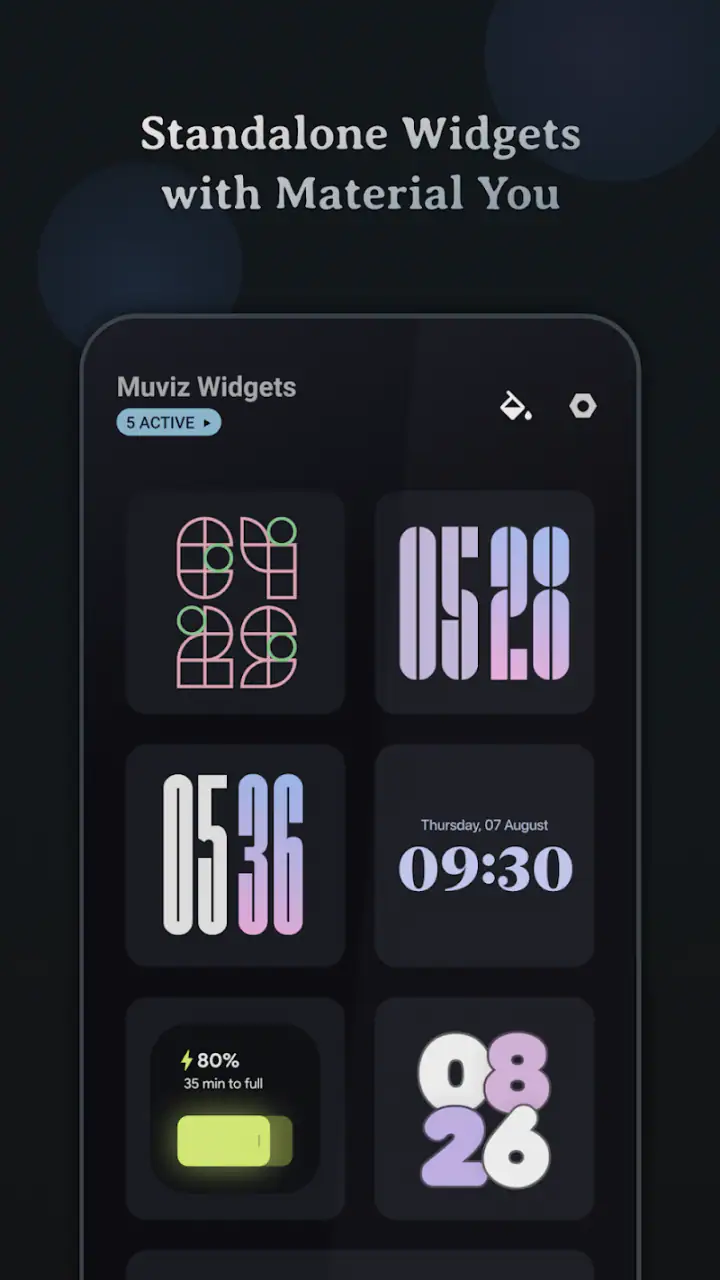
I would also check whether the widget is sitting behind another panel, folder, or oversized item. Home screens can become visually crowded, and a newly placed widget may be present but difficult to see. Moving it to a clear page makes the test more reliable. If the design uses system colors, I would briefly compare it with a different wallpaper or theme so I could tell whether the issue is visibility rather than loading.
These are deliberately basic checks, but they matter because widget behavior is shared between the app and the launcher. A problem that appears to be inside Muviz Widgets may actually come from the home-screen layout or the phone’s system version. I prefer identifying that boundary before changing advanced settings.
Making the first setup less frustrating
I recommend starting with one clock widget rather than filling the screen with several designs. Place it in the position where you normally look for the time, then live with it for a little while. This reveals practical issues that a preview cannot: whether the text is readable at a glance, whether it competes with icons, and whether the size fits the way you use your phone.
If you are interested in the music-oriented side of the app, I would test it after the clock is comfortable. That gives you a clean baseline. If something looks wrong later, you will know whether the change came from the new widget, the launcher arrangement, or the system theme. It is a small workflow improvement, but it saves time when experimenting with several personalization choices.
The app’s free entry point is also useful here. I would explore the available styles and understand how they fit my screen before considering any optional purchase. Since individual in-app items cost $2.49, the sensible approach is to pay only for a design or element that genuinely improves your everyday layout rather than buying several items during the first session.
Recovering a workflow when something looks wrong
Widget problems are often easier to solve by rebuilding the small part that failed. If a clock is visible but appears stuck, I would remove that widget from the home screen and place it again. This refreshes the connection between the selected design and the launcher without forcing me to change the entire setup. I would avoid deleting every home-screen arrangement unless the issue affects more than one widget.
If the app opens but the widget picker does not show its entries, I would restart the phone and check the picker again. A launcher refresh can be more relevant than clearing unrelated apps. I would also make sure I am looking under the correct app name in the widget list, because the label shown in the launcher may not be identical to the wording used in a store search.
When the appearance changes unexpectedly, I would retrace the last visual change: wallpaper, system color selection, icon layout, or widget size. This is especially important with Material You-style personalization, where the surrounding phone theme can influence the impression of the widget. Reverting one change at a time is more informative than resetting everything at once.
A practical recovery habit is to keep the home screen simple while testing. One widget, a plain wallpaper, and a clear area provide a useful control setup. Once the clock is visible and readable, I would add other elements gradually. This approach is not exciting, but it makes it much easier to identify the exact step that causes a layout or visibility problem.
Using it in a normal day
Imagine checking your phone between meetings or while cooking. You want the time immediately, but you also want the home screen to feel less generic. A well-sized clock widget can handle that glance without opening an app. Later, if you use music during a commute or workout, a music-focused widget may make the same screen feel more connected to what you are doing. The value is not that it adds another destination; it is that the information sits where you already look.
That benefit depends on restraint. I would not cover the entire home screen with decorative elements, because the clock can lose its practical role. I prefer leaving space around it and keeping the most frequently used icons nearby. The app works best when its visual choices support the phone rather than turning the home screen into a display that is attractive but slow to use.
This is also where it differs from the usual alternatives. A standard system clock widget is often quicker to place and less visually distinctive. A wallpaper-only personalization app can change the mood of the phone but does not provide an information panel. A dedicated music widget may focus more narrowly on playback, while this app’s appeal comes from combining clock presentation with a wider personalization direction. I would choose it when the home screen itself matters to me, not when I only need the simplest possible time display.
When the app is not the cause
It is tempting to blame a widget whenever it disappears, fails to update, or looks different after a system change. In practice, the launcher is an important part of the chain. A launcher update, a changed grid size, or a modified wallpaper palette can alter the result without the app itself being broken. If other widgets are also behaving strangely, I would investigate the launcher or the phone first.
The Android version is another important boundary. Because the app requires Android 12 or newer, an older device is not a good candidate for testing it. I would not spend time searching for workarounds on unsupported software. The more useful choice is to use a compatible phone or select a widget app designed for the system version already installed.
Visual dissatisfaction can also be a mismatch in expectations. The app is designed for people who enjoy changing the look of a home screen. If I want a completely neutral clock with minimal decisions, a built-in widget may be better. If I need highly specialized automation or a very specific information layout, I would look for an app built around that single purpose rather than expecting a personalization tool to cover every advanced workflow.
Who will get the most from it
I think this app suits Android users who notice details such as typography, spacing, color matching, and the relationship between a widget and a wallpaper. It is particularly appealing if the default home screen feels dull and you want more character without replacing the entire launcher. The free installation makes it easy to explore, while the optional items leave room for a more selective approach to customization.
It is less suitable for someone who never uses home-screen widgets or who becomes annoyed by even a short setup process. It is also not the right choice for a device below Android 12, since compatibility is a basic requirement rather than a minor preference. People who want one fixed clock and no visual experimentation may find the system option more efficient.
For me, the strongest use case is a carefully arranged home screen where the clock is both readable and part of the overall design. The app adds value when I am willing to spend a few minutes choosing the right size, testing contrast, and keeping the layout uncluttered. Its weakness is the same thing that gives it personality: the result depends on the surrounding phone setup, so it is not entirely automatic.
My practical verdict
After using it as a real home-screen customization tool rather than merely browsing its designs, I see Muviz Widgets: Clock, Music. as a good fit for Android users who want their clock and music-related presentation to feel more personal. Sparkine Labs has aimed at the part of the phone I look at most often, and the combination of clock styles with Material You-oriented presentation gives it a clearer identity than a plain system widget.
I would install it if I wanted a more expressive home screen and was comfortable doing a little visual tuning. I would begin with one widget, test it against my wallpaper, confirm that the launcher displays it correctly, and only then consider any $2.49 optional item. That workflow keeps the experience practical and avoids paying for designs that do not suit the phone.
The app is free, rated for Everyone, and has already passed the 100 thousand install mark, with a 4.6 average that suggests many users enjoy the result. Those figures do not remove the setup friction, but they do support the impression that the concept works for a sizable audience. My final recommendation is straightforward: choose it for thoughtful, everyday personalization; skip it if you want a zero-adjustment clock or if your phone cannot run Android 12 or later.
FAQs for Muviz Widgets: Clock, Music.,
What is Muviz Widgets: Clock, Music?
Muviz Widgets: Clock, Music is a customization app designed to add stylish clock and music-related widgets to your Android home screen. After installing it, you can choose from different visual designs, adjust colors and layouts, and place useful information where it is easy to see. It is mainly aimed at users who want a more personalized and functional home-screen appearance.
What features does Muviz Widgets: Clock, Music offer?
The app focuses on customizable widgets for displaying the time and music information. Depending on the selected design and device compatibility, widgets may show details such as the current track, artist, playback controls, album artwork, or visual effects. Users can generally modify the appearance to match their wallpaper, icons, or overall theme, making the home screen feel more coordinated.
Is Muviz Widgets: Clock, Music free to use?
Muviz Widgets: Clock, Music may provide free widget designs and basic customization options, while some premium styles, advanced controls, or additional features can require an in-app purchase or subscription. The exact selection may change with updates. Before downloading or purchasing anything, check the app’s current store listing for pricing, trial conditions, and which features are included at no cost.
Does the app work with every music player and Android device?
Compatibility can vary depending on your Android version, device manufacturer, music player, and permission settings. Popular music applications may work correctly, but some players might not provide complete track information or support every playback control. If a widget does not update, reviewing notification, music access, battery optimization, and background activity permissions can often help restore proper functionality.
Does Muviz Widgets: Clock, Music affect battery life or privacy?
Like other home-screen widgets, Muviz Widgets: Clock, Music may use a small amount of battery because it refreshes the clock and music information. The impact is usually limited, although animated designs or frequent updates can consume more power. Users should also review the permissions requested by the app and install it only from an official store to reduce privacy and security risks.
Pros
- Wide selection of stylish clock and music widgets
- Lock screen and home screen customization options
- Music controls are convenient and easy to access
- Supports different themes
- colors
- and layout styles
- Useful visualizer effects add personality while playing music
Cons
- Some advanced widgets and themes may require a premium upgrade
- Battery usage can increase when animated visualizers stay active
- Compatibility may vary across Android launchers and device models
- Setup may take time due to the many customization settings
- Certain music features depend on support from the installed player


